HUFS UI

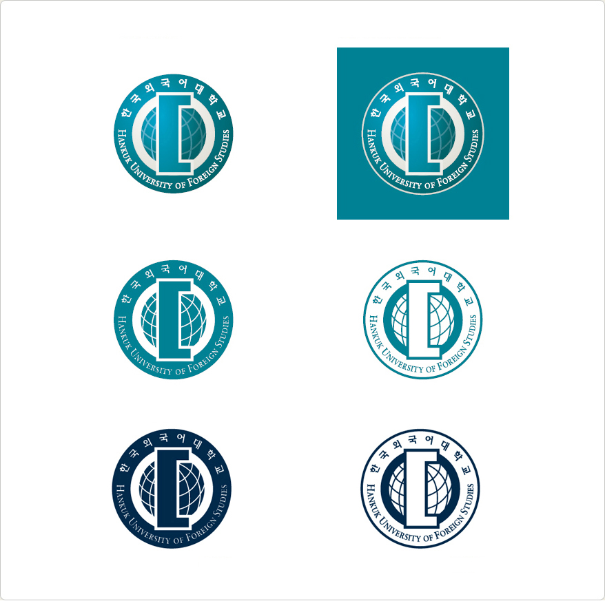
The renewed HUFS emblem is of a more modern style but retains its familiarity from the previous design. It is generally round and symbolizes the spirit of a HUFS student standing tall at the center of the world. The Korean initials “o” and “ㄷ” are basic elements and are designed graphically. The longitudes and latitudes of the earth express HUFS’s firm commitment to globalization.
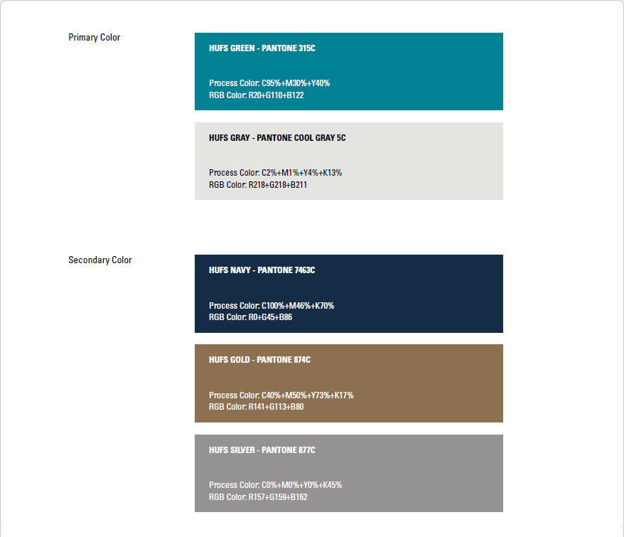
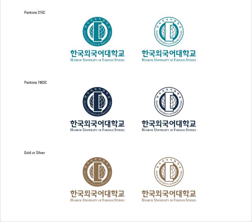
The bluish-green (Pantone 315C) represents future, life, growth, hope, and other such uplifting things, and the following grid system must be complied with.
This symbol is the most important element in the HUFS image integration effort. It must be used according to the item-specific rules: it cannot be modified arbitrarily.
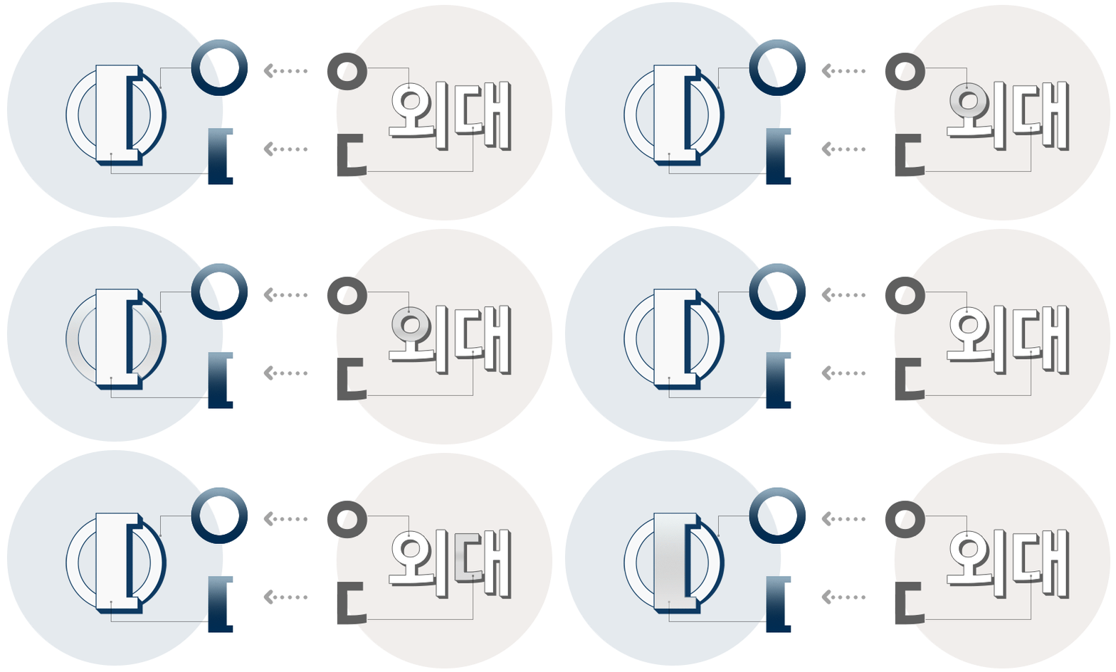
OLD UI · The ‘ㅇ’ and ‘ㄷ’ are derived from ‘외대’.
· The ‘ㅇ’ symbolizes the earth where HUFS is cultivating young talents to the world.
· The ‘ㄷ’ symbolizes the university’s principles: Truth, Peace and Creativity. It also signifies the keys to open a door to these principles.

Grid System

HUFS Symbol

Color Scheme


The HUFS UI should not be used for commercial purposes.

 Contact Us
 Campus Map
 Home
Home

